Case Study · Product Design · UX Research

Smart Rewards for Better Training
The Project
Remote treat dispensers—the backbone of science-based, positive-reinforcement dog training—haven't meaningfully evolved in over a decade. The dominant device was released in 2008, jams constantly, only works with specific kibble sizes, and offers zero data or connectivity. CuePo was designed to replace it: a low-profile, jam-resistant smart dispenser, a three-button remote, and a companion app that finally gives trainers the data layer they've been tracking on paper.
Domain Expert & Research Lead
The other team members focused on researching the electronics, visualizations, and the 3D build.
Many dog trainers depend on remote reward-based training tools, yet existing options are outdated, costly, and disappearing. These limitations undermine effective, science-based training in real-world environments and are creating a growing gap in the professional dog-training market.
Dog sports is one of the fastest-growing segments in the pet industry, yet professional trainers are being failed by outdated, fragile equipment. Three problems define the market gap:
«The market gap is not subtle—when we started asking trainers what they wanted, the enthusiasm was immediate. The community was ready for something better.»
Disc clogs mid-session, interrupting training at exactly the wrong moment. For a professional running six sessions daily, each jam is a training failure.
Progress is tracked on paper or from memory. There is no session logging, no statistics, no way to analyse performance over time.
The market-dominant device is increasingly hard to source outside the United States, creating an urgent gap in the professional training community.
The dominant tool in this space is 17 years old, increasingly hard to source, and has no credible modern challenger. Market sizing confirmed the opportunity was real before we committed to a direction.
Global pet training products and services market. North American and European dog training segments represent the primary growth driver, fuelled by rising pet ownership and sport participation.
Positive-reinforcement and competitive dog sports trainers in North America and Europe—the segment actively using or seeking remote treat dispensers. No credible modern product exists for this audience.
A realistic 1–5% capture of the SAM through direct-to-consumer sales, with expansion via accessories, replacement modules, treat packs, and a B2B channel through training facilities.
I brought 30+ years of hands-on training experience to this project—professional trainer, regional competitor, national committee member. That access gave the research immediate credibility: I could ask the right questions, recognise nuance in the answers, and translate findings into design decisions that were grounded in how training actually works. I led the discovery phase end-to-end: survey design, one-on-one interviews, competitive analysis, and synthesis.
of trainers named jamming as their top frustration
CAD pricing sweet-spot, identified through surveys
alternative product categories evaluated—none met pro standards
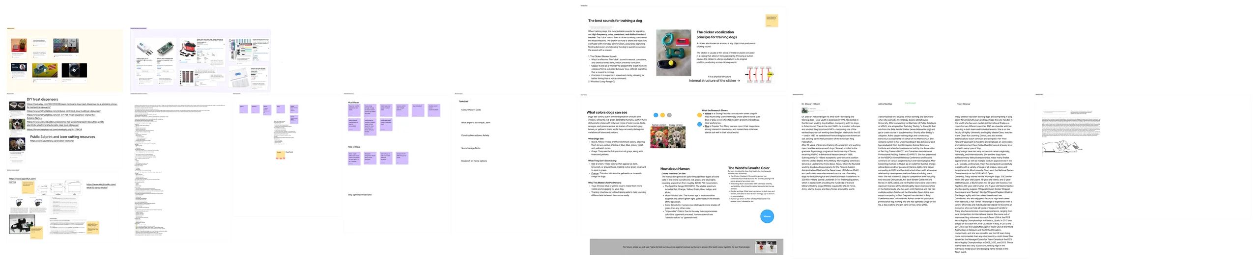
Desk Research

Interviews
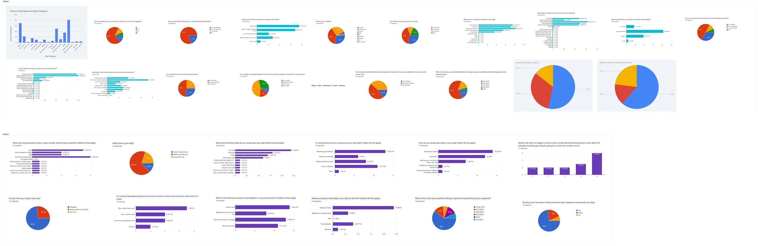
Survey Results
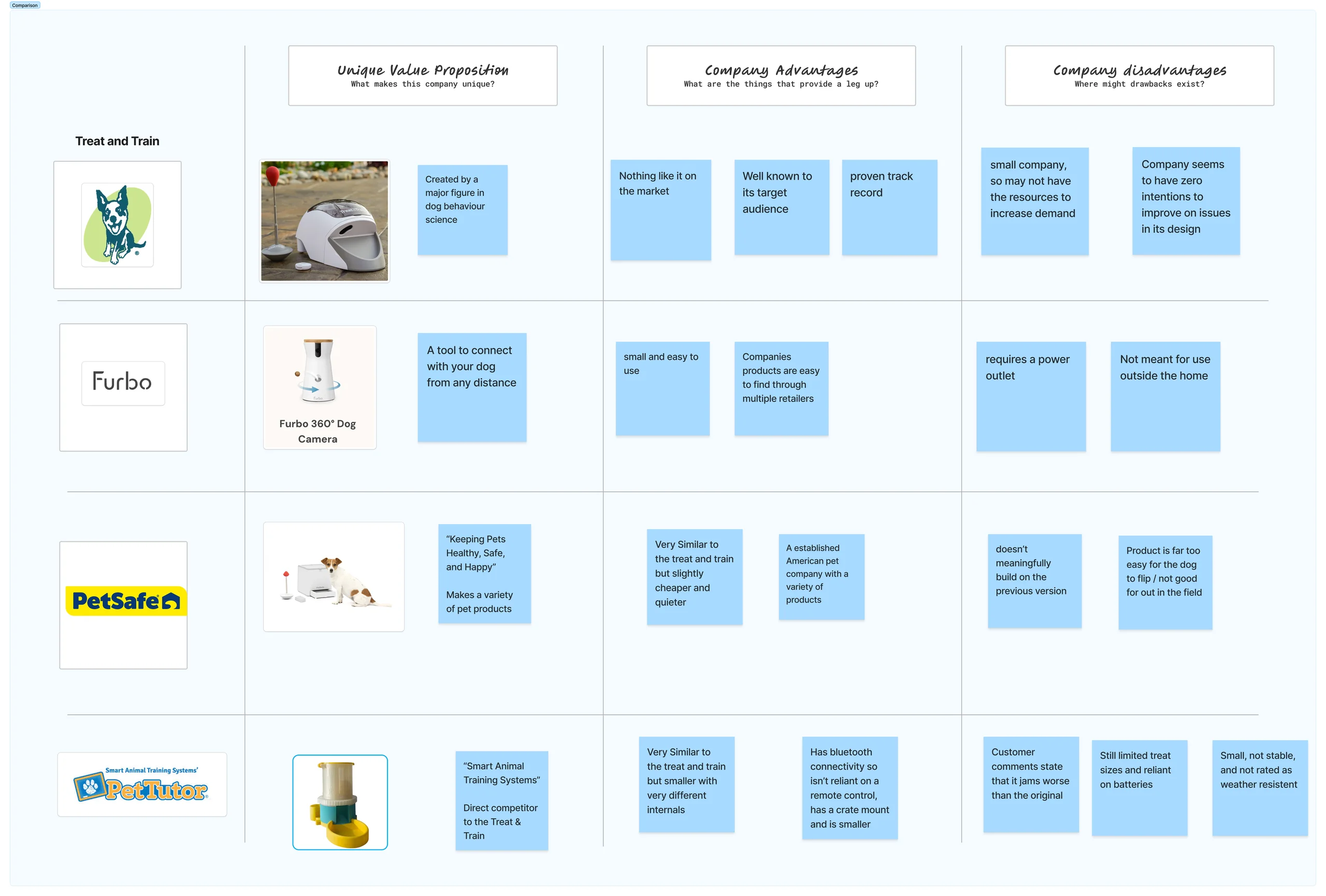
Competitive Analysis
Survey results and interviews with active trainers surfaced the same frustrations across experience levels.
The disc mechanism clogs with any treat that varies slightly from spec. Trainers working six sessions a day can’t afford a failure mid-run.
No session logging, no stats, no way to compare performance over time. Trainers are building mental models from memory alone.
The market-leading tool released in 2008 is increasingly hard to source outside the US. Trainers in Canada and Europe are feeling the gap acutely.
Trainers would pay CAD $200–300 for a device that actually works reliably—well above commodity price points, signalling genuine willingness to invest.
The research sample skewed toward existing competitive agility and dog sports participants—a motivated, informed group. This means findings may not fully represent casual pet owners or new-to-sport handlers. Additionally, the online survey format limited depth on some nuanced use cases; in-person observation would add an important layer in a future iteration. These limitations are acknowledged but do not undermine the core signal: the professional training segment has a clear, urgent, unmet need.
Drawing on my training background, I helped the team develop two personas that grounded every subsequent design decision. The personas are based on composite archetypes drawn from survey data and interviews with real trainers in the agility and dog sports community.

Samantha "Sam" Keller
Owns and operates a dog training business, competing in agility and dog sports at the highest level. Currently developing a young prospect dog with international competition goals.

Alex Morgan
Recently entered the world of agility competition. Works full-time outside the dog industry. Highly motivated but still building handling and timing skills. Struggles to reward away from her body.
Translating research findings into a formal product requirements document was critical to ensuring that design decisions were traceable back to user needs. I led the prioritisation process that shaped these requirements—applying domain expertise to distinguish real constraints from assumptions, and making sure every specification had a justification rooted in what trainers actually told us.
One of my most consequential contributions was determining which features to build and which to defer. I synthesised the research data and applied domain knowledge to force-rank the feature set.
Three scenarios illustrate how CuePo integrates into real training sessions across our two primary personas—each revealing a different capability of the system.

The jamming problem was the non-negotiable—76% of trainers named it as their top frustration, so solving it wasn't optional. We started by studying how other industries had approached the same challenge: moving small, irregularly shaped objects reliably, one at a time. Candy dispensers and pill dispensers were the primary reference points—both had to solve exactly this problem at consumer scale.
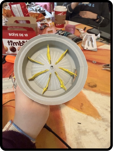
What we landed on was a hybrid: combining the gravity-fed hopper cone from one pill dispenser design with the rotating paddle agitator from another. The agitator spins to prevent bridging and break up clumps, while gravity does the rest of the work. The result:

Cardboard prototype for the agitator: gravity-fed, clog-resistant, easy to service
Getting the agitator geometry right took multiple rounds of cardboard prototyping before we touched the 3D printer. There were many casualties—cardboard boxes, gorilla tape, patience—none of which died in vain. Each iteration taught us something specific: paddle angle, paddle count, hopper cone slope, the minimum clearance needed to prevent bridging with different treat types.
I built the cardboard prototypes of the physical device and the agitator mechanism—the critical low-fidelity stage that proved the concept was viable before the team invested time in 3D modelling. We also used air-dry foam clay to explore remote button placement and ergonomics in parallel.
What the cardboard stage confirmed:
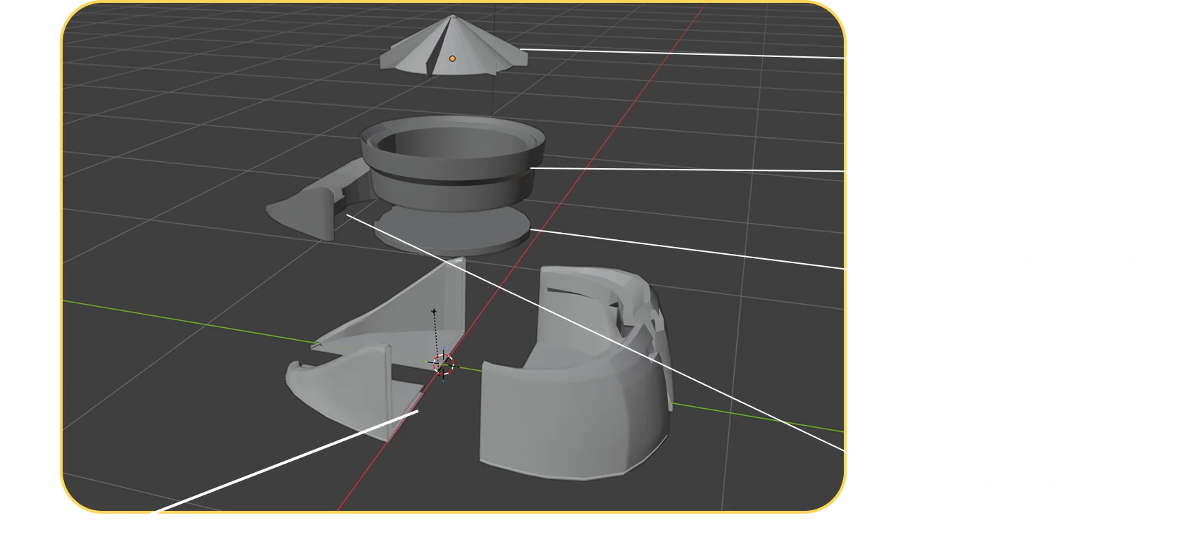
3D exploded view—created in Maya and Blender
Animated exploded view—created in Maya and Blender
I led and conducted the in-person remote usability testing—building the foam prototypes, recruiting participants from the agility community, running the sessions, and synthesising the findings. Testing revealed a genuine surprise that directly changed the design direction.
I built three air-dry foam clay remote prototypes based on earlier sketches. The prototypes explored two primary variables: overall body size (larger vs. smaller form factor) and button layout (different arrangements and surface textures for blind operation).
Five agility competitors tested the prototypes in-person, handling them as they would during an actual training session—remote in hand, attention on a simulated dog and course.
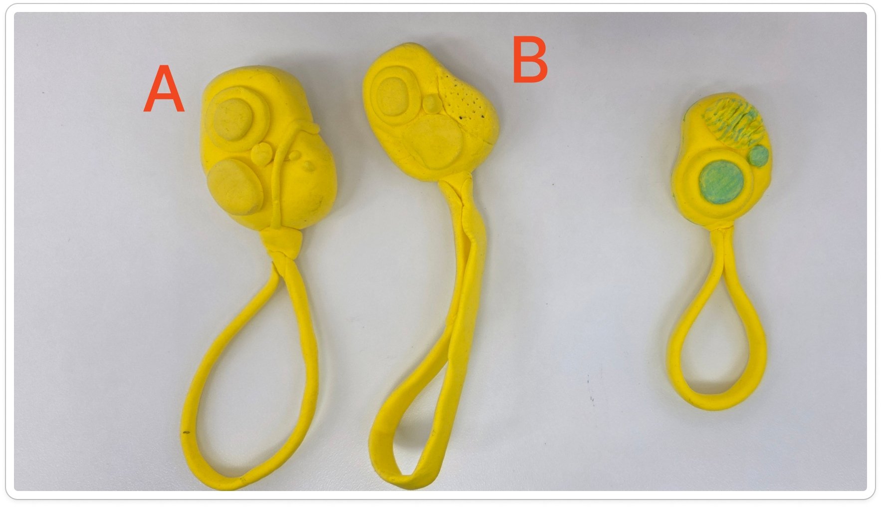
Prototype A (left, largest body) was the clear winner. Prototype B (right, smaller body) was expected to win but ranked last.
Prototype A (far left, largest body) was selected as the preferred design by the majority of testers. The team's initial hypothesis was that the smaller remote would be preferred. It wasn't even close.
Testers were running and handling simultaneously. The larger form factor provided significantly better grip—less likely to drop, easier to locate by feel, more confident to use without breaking focus.
The larger prototype felt more durable. At outdoor agility sessions, equipment takes a beating. Perceived robustness directly affects confidence in the tool.
Buttons need different textures—concave, ridged, or bumped—so trainers can identify which button they're pressing without looking away from their dog.
«We expected the smaller remote to win—easier to carry, less bulk. But under real conditions—running, looking at a dog, managing the course—the larger remote won by a wide margin. Testers felt more secure and in control. It changed our direction entirely.»
The remote user testing was conducted as an in-person session with five competitive agility participants. Sessions focused on ergonomics, grip confidence, and button identification under simulated active-use conditions. Team discussion confirmed the remote must function fully without a phone present—the app is additive, not required for basic operation.
Every design choice in the device traces back to a specific research finding.
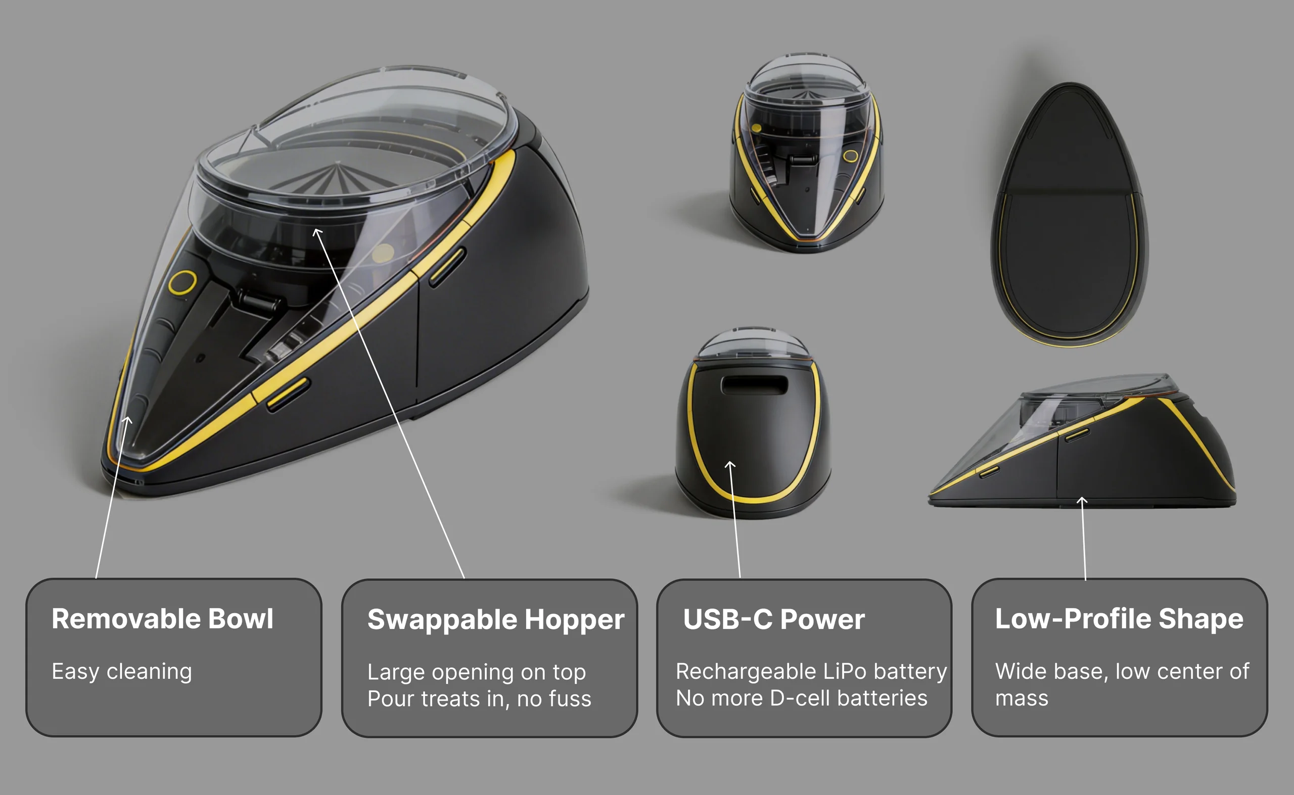
Final 3D render: Removable Bowl · Swappable Hopper · USB-C Power · Low-Profile Shape
Wide base, low centre of mass—dogs can't topple it during active sessions.
Gravity-and-agitation-fed dispensing works with varied treat sizes, no clogging.
Large top opening for easy loading and switching between different sizes of treats. Fully removable for cleaning.
Charge it like a phone. No more hunting for D-cell batteries at outdoor sessions.
Three buttons. Zero confusion. Designed for one-handed use when your attention has to stay on the dog. Form factor informed directly by user testing—the larger body won.
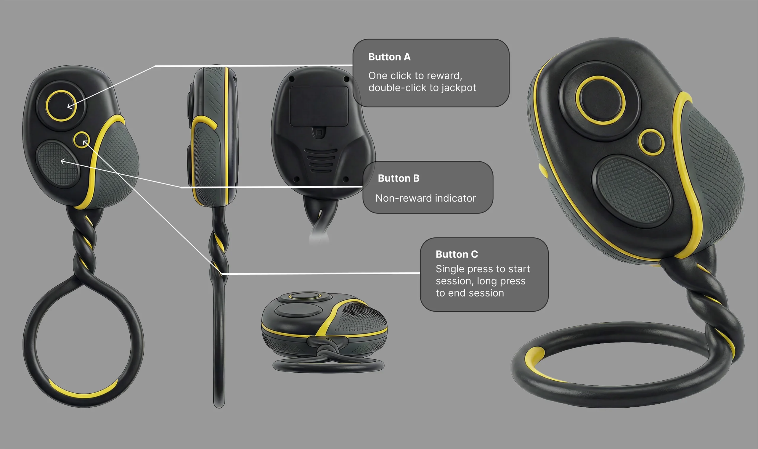
Final remote design: larger body (user-tested winner) · wrist lanyard loop · three distinct-texture buttons
I built the app prototype entirely—beginning with early wireframing assisted by Google Stitch and Figma Make to rapidly explore layout structures and interaction patterns, before transitioning to full-fidelity design in Figma Design for the final prototype. The app covers three primary flows: onboarding & device pairing, live training sessions, and the dashboard with stats and settings.
Before moving into full-fidelity Figma Design, I used Google Stitch and Figma Make to rapidly explore the overall structure and key interaction patterns. These early screens established the core layout logic—navigation, session hierarchy, and data display—before any visual polish was applied.
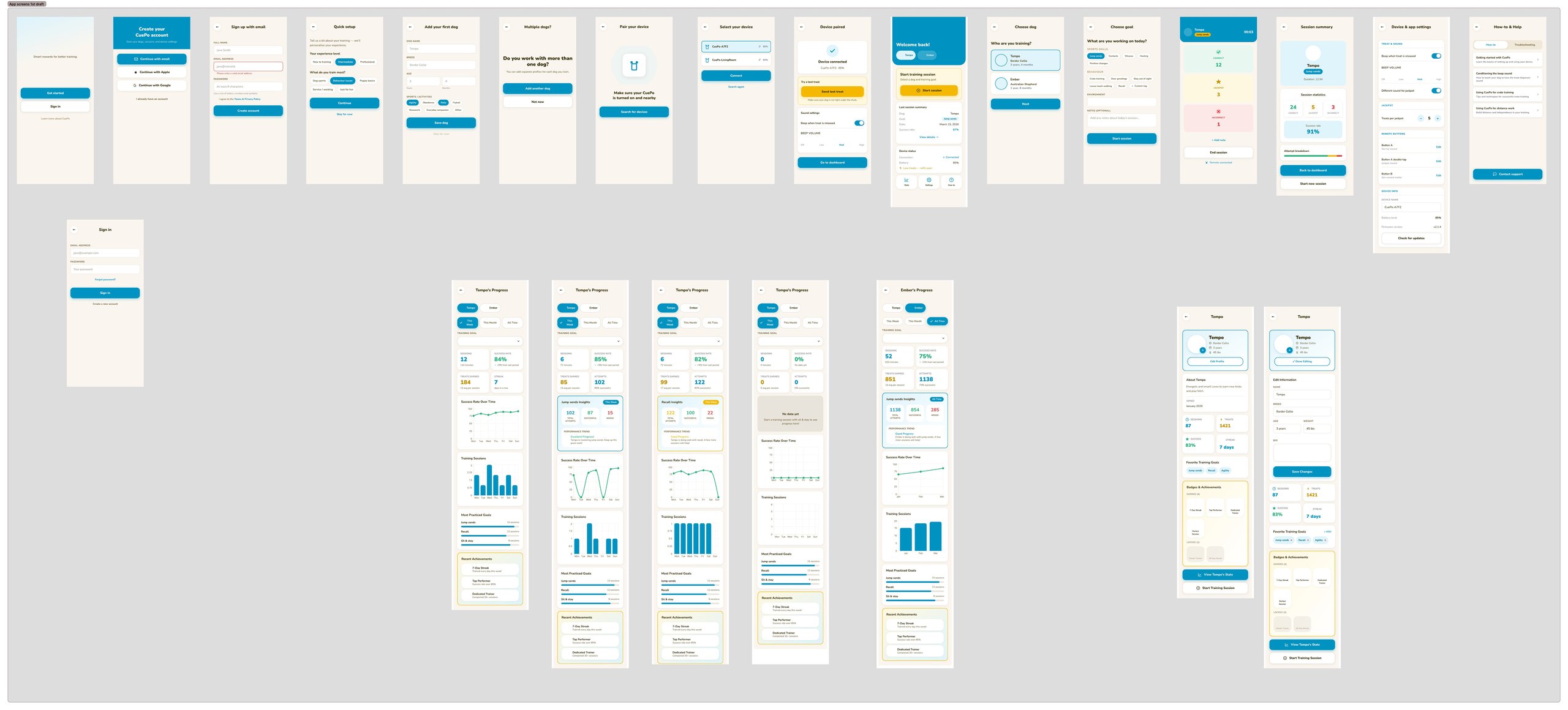
Early wireframe exploration—structure and interaction logic before visual design was applied
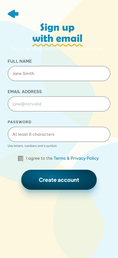
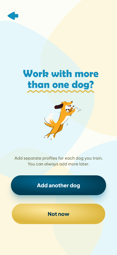
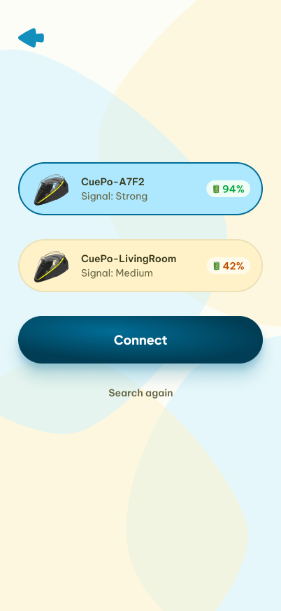
Eight screens take a new user from welcome to their first live training session—including account creation, dog profile setup, and Bluetooth device pairing with a live test-treat confirmation.

Welcome Screen

Sign In

Create Account
Quick Setup

Add Dog

Dog Details
Dog Sport

Device Search
Device Connected
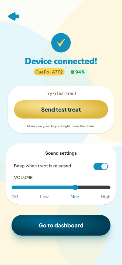
Test Treat
«Training that clicks.»—the CuePo tagline anchors the first impression. Two clear paths: Get Started (new) or Log In (returning).
Email, Apple, or Google sign-in. Designed for speed—most trainers will create an account before a session, not during one.
Experience level and primary sport selection personalises the app experience from the start—without requiring it (skip is always available).
Name, breed, age, and sport activities. Sam's first dog is Tempo—a Malinois. Multi-dog users can add multiple profiles before pairing.
Bluetooth scan shows nearby CuePo devices with signal strength. Connection success triggers an immediate test treat—confirming the full loop works before the session starts.
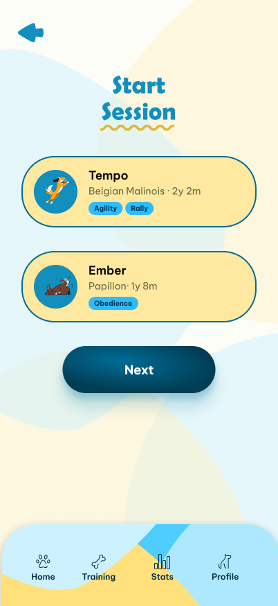
The training flow is the heart of the app. It was designed to be used with one hand while the other is managing a dog—large tap targets, instant feedback, and a session summary that makes progress visible at a glance.
Select Dog

Choose Goal

Live Session
Training Summary
For multi-dog trainers, choose which dog you're working with. Each profile shows active sports/activities for quick context.
Goal tagging—the exercise name that all session data will be logged against. Quick-select chips for common skills; environment and notes fields for additional context.
Three oversized buttons—Correct (green), Jackpot (yellow star), No Reward (red)—designed for one-thumb use. Remote connected indicator visible at all times. Live counters track each outcome type.
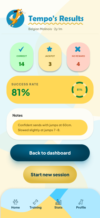
Tempo's Results: 14 Correct · 3 Jackpot · 4 No Reward · 81% success rate. Notes field captures qualitative observations. Two clear CTAs: Back to Dashboard or Start New Session.
The dashboard closes the loop that the research identified: trainers need to see objective progress over time. The stats view gives a trainer like Sam a week-over-week view of success rate, jackpot frequency, and total session time—the data layer that never existed before.
Home Dashboard

Device Settings

How-to Guide
Session History

Tempo's Profile
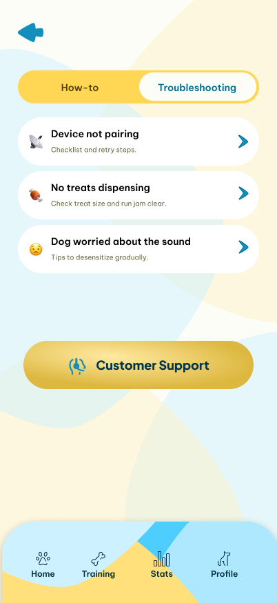
Troubleshooting
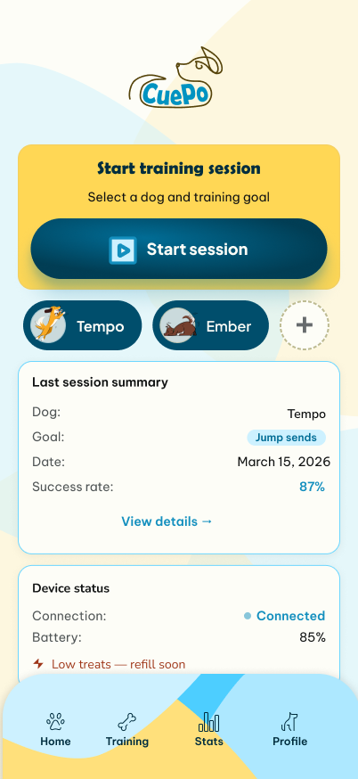
Last session summary card, device status (battery + connection), and a prominent Start Session CTA. Everything a trainer needs at the start of a session without navigating anywhere.
Week / Month / All Time toggle. Key stats: 84% avg success, 12 sessions, 7 jackpots, 184 total attempts, 3.5h total time. Success rate chart over seven days. Goal progress bars (Jump sends 88%, Contacts 72%). Recommended next exercise—Weave entries, not trained in 8 days.
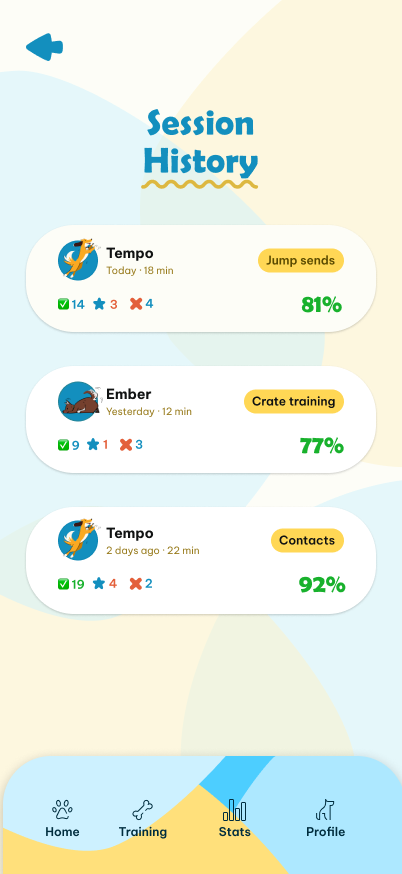
Chronological log across all dogs—Tempo, Ember—with goal tag, duration, success %, and per-session outcome breakdown. The data layer trainers have always wanted but never had.
Device & App Settings covers treat sound, jackpot quantity, and remote button mapping. How-to and Troubleshooting tabs provide in-app guides—reducing support friction for first-time users.
Building the physical prototype was the most technically demanding phase of the project. The team explored several 3D printing options—including full-scale prints using ABS and PETG—but ultimately decided on a scaled-down proof-of-concept model that would demonstrate the core mechanism without requiring the full production toolpath.
The Bambu Lab X1-Carbon was used for all printing, with components modelled in Maya and Blender across multiple iteration cycles. What followed was eight straight hours of work and experimentation—reprinting failed components, adjusting servo angles, troubleshooting BLE pairing, and refining the agitator geometry until the mechanism dispensed reliably across multiple treat types.
ABS and PETG tested; full-scale deprioritised in favour of a scaled-down proof-of-concept model to keep the build achievable within project constraints
Multiple paddle designs printed and tested—angle, paddle count, and hopper cone angle all adjusted to achieve reliable gravity-assisted flow
Ashley handled wiring and code; trigger timing was tuned to dispense exactly one treat per press without double-dispensing
Bluetooth Low Energy link established using phone as remote at this stage; latency tested across treat-dispensing scenarios
Reliable single-treat dispensing, agitator mechanism functional across treat types, BLE remote trigger confirmed—proof of concept achieved



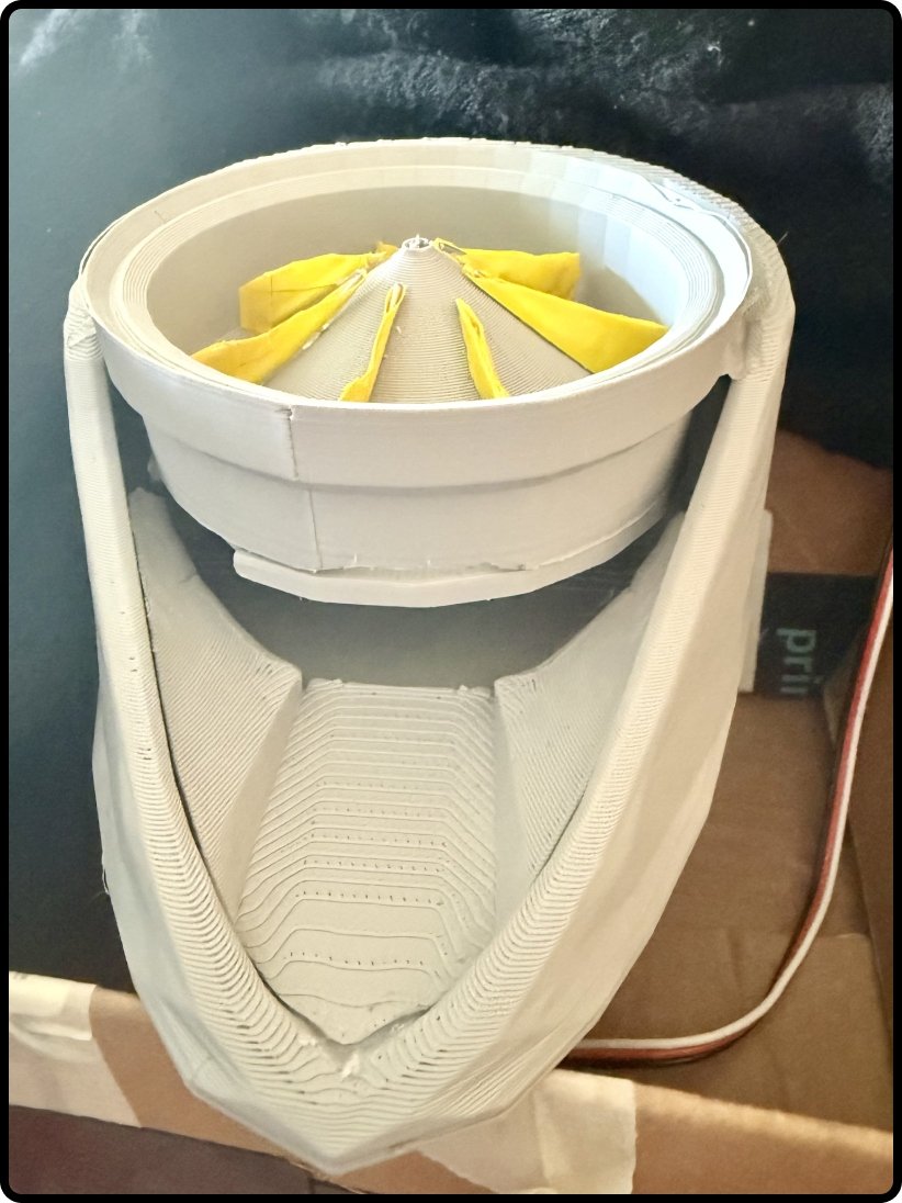
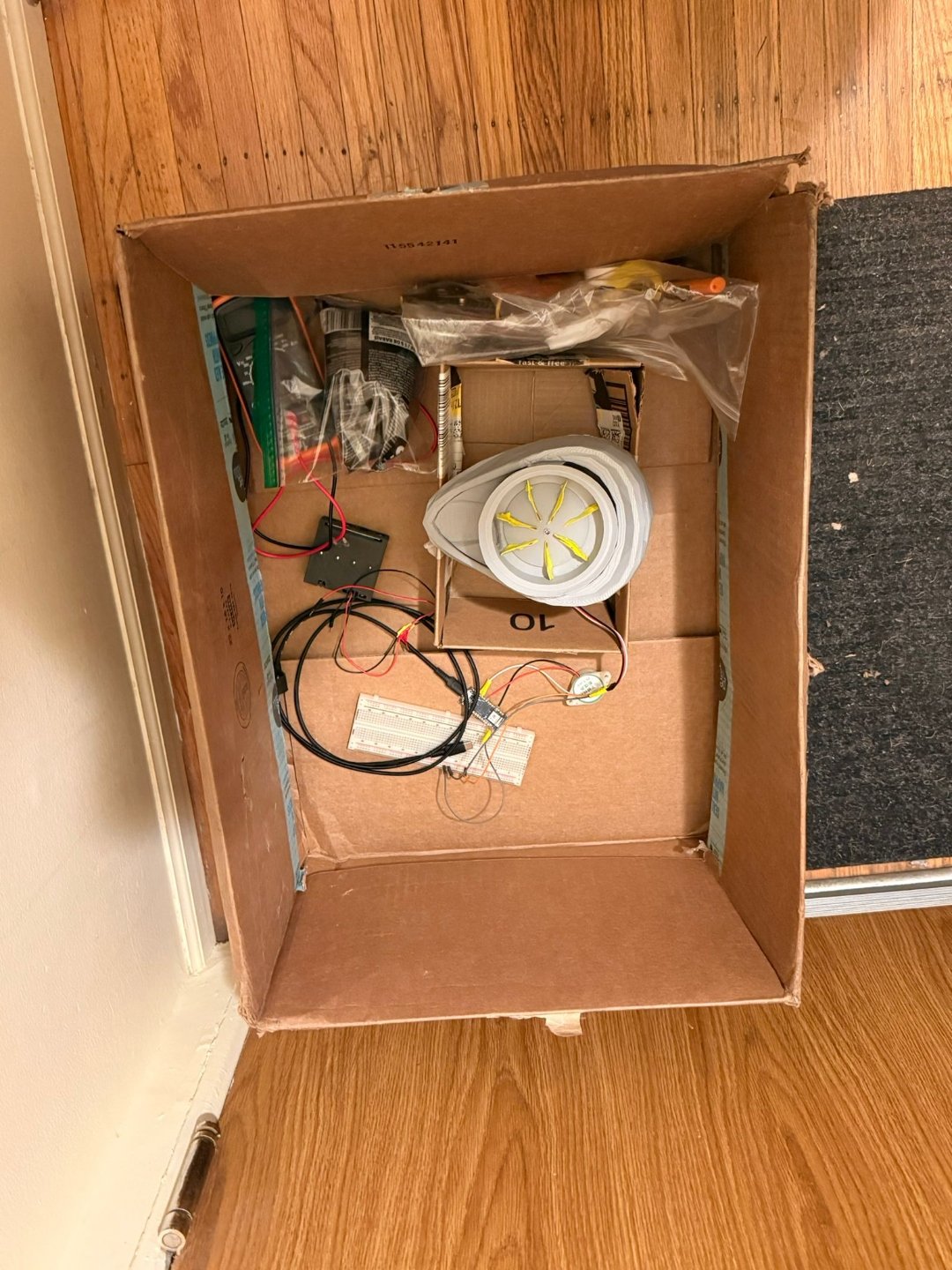
After eight hours of building, printing, and debugging—here's the CuePo prototype dispensing a treat on command via Bluetooth remote.
Jam-free dispensing validated—the agitator mechanism reliably delivered single treats across multiple treat types without clogging
The core technical stack proved viable: servo, Arduino, and Bluetooth Low Energy working together to trigger treat delivery on command
Remote ergonomics resolved through real user testing—five agility competitors confirmed the larger form factor before any CAD commitment was made
The app prototype covers all three core flows—onboarding, live session, and dashboard—giving trainers the data layer that has never existed in this category
Low-profile form factor designed and physically built—a scaled proof-of-concept that demonstrated stability and mechanism function in a single eight-hour build session
Every design decision is traceable to a research finding—this is a product shaped by the people who will actually use it, not by assumptions
Because I understood training culture—the language, the failure modes, what a jam actually costs in a live session—the research moved faster and the insights were sharper. The 76% jamming statistic wasn't a surprise to me; what it did was give the team an unambiguous mandate to treat the anti-jam mechanism as the non-negotiable feature.
The remote user testing produced a genuine surprise—the larger prototype won convincingly, despite our expectation that smaller would dominate. This was exactly the kind of finding that only emerges when you get out of the building and test with real people.
The research surfaced a long list of real needs. The "must have / should have / nice to have" framework made prioritisation conversations more objective—but it took active effort to hold the line against feature creep.
Involving trainers in physical prototype feedback earlier—not just in the research phase, but as hands-on testers at cardboard stage—would have surfaced form-factor issues sooner. Next time, I'd define specific success metrics before building, not after.